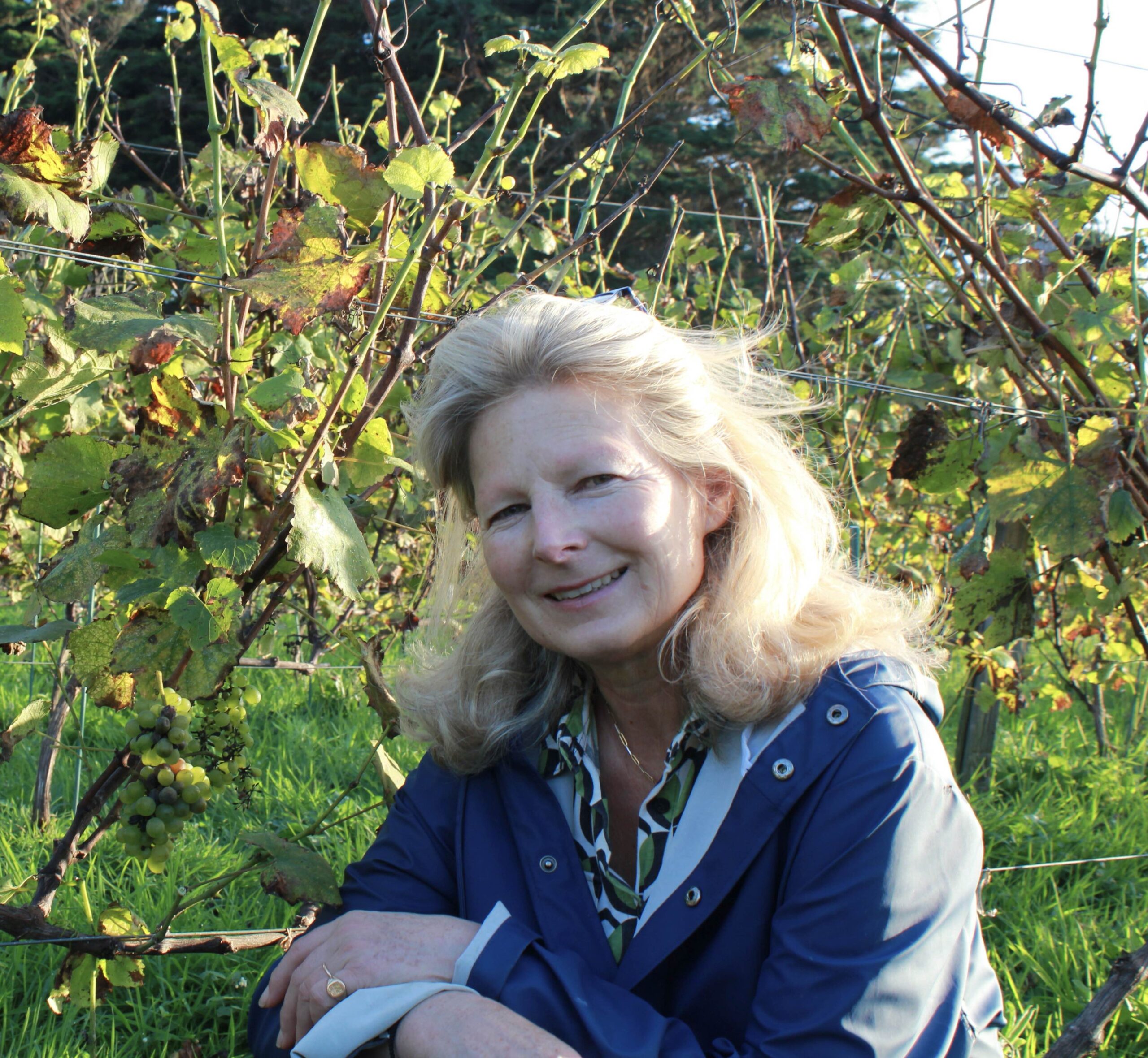
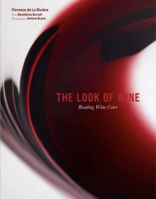
At the head of the Orangedesigner design office, this colour specialist presents “The Look of Wine”, a book that invites us to look at wine differently, with greater simplicity, through sight, our most universal sense. Presentation, on the occasion of her participation in the 2025 edition of Livres en Vignes.
What does your profession involve?
I shape spaces, using matter, colour, and light. When it comes to public places, people’s well-being guides my approach. For private commissions, visual comfort and clients’ expectations regarding atmosphere are added to this.
How did you come to the world of wine to the point of teaching its colours at the Faculty of Oenology in Bordeaux?
Colour is multidisciplinary by nature. Wine is no exception. Yet in this field, chromatic vocabulary is lacking. Visual tasting has been disregarded and has lost its words. With this in mind, and given my expertise, the Faculty of Oenology in Bordeaux invited me to restore to visual tasting the vocabulary it requires, to once again be able to put intelligible words to the sensations perceived in such moments of sharing. To achieve this, training was necessary: having lived in Bordeaux for nearly 30 years, I had a very decoded approach to wine. I therefore multiplied my encounters with winegrowers, sommeliers and other experts such as Jacques Puisais, founder of the Institut du Goût, or Pascal Ribéreau-Gayon, professor emeritus at the Institut d’Œnologie de Bordeaux. I also carried out a great deal of research, with “Le Goût du Vin” as a guiding reference. This seminal work, initiated by Émile Peynaud and later continued by Jacques Blouin, greatly helped me in my first reflections for my book.
You spoke of visual tasting being disregarded…
In the 19th century, words were still being used and their meanings were understood. Then, little by little, figures replaced them. Wine colours were no longer discussed but analysed. Laboratories claimed it as their own. But who do these indicators speak to? Tasting requires words – accessible ones at that: it is a moment of exchange and sharing. As Bernard Pivot used to say, “wine is a vector of culture”. It is up to us to cultivate this, to transmit it, and therefore to provide the vocabulary needed.
To use the right words, one must first know what he is talking about. This is precisely the subject of the first part of your book. What determines the colour of a wine?
Its hue and its colour intensity. The latter is defined both by the quantity of matter – is the shade light or dark? – and its quality – is it bright or dull? –. The former is at the heart of the subject. In my book, I identified five major families of hues for reds: ink, purple, ruby, garnet and tiled. I wanted strongly to keep it simple. To me, it was essential that readers discover these words and immediately understand them through photography, so they could instantly memorise them, use them correctly in future, and share them in turn.
The illustration of your book therefore required a full photographic protocol…
Entire suitcases’ worth of equipment, which photographer Jérôme Bryon had to carry everywhere. He created a portable studio that isolated the glass from its environment and exposed it to neutral, replicable light, allowing comparisons from one wine to another. Yet when it came to very dark and very light colours, this set-up was not enough. The eye sees things the photograph cannot render. We therefore had to reinvent our method for these hues, in order to provide the most accurate possible interpretation.
In everyday life, how can each of us best appreciate the colour of a wine? Are there particular rules or customs to observe?
Yes, absolutely. First, natural light; then a certain quantity of wine, identical from one glass to another if you are comparing – since this influences your perception of colour – and finally, tilting the glass, holding it by the stem between thumb and forefinger, so as not to mask the wine’s colour with your hand and to be able to observe its disc and rim as you should. The disc reveals its colour intensity, and the rim its hue, in all its nuances.
What information does the colour of a wine provide?
It is often said to be the “face of the wine”. One can read its age and its character in it. More concretely, visual tasting can provide indications of a northern or southern facing, a grape variety, a stage of evolution… But beware: these are not absolute truths, rather clues that subsequent analysis will confirm or contradict. “The clothes don’t make the man”: each choice made by the winemakers, in viticulture as in vinification, has an influence on the colour of their wines.
In the second part of your book, you took care to question many winemakers about their relationship with colour. Would you say it guides their practices?
In a way, yes. They use their sight every day, though often without realising it, like automatic reflexes. With some exceptions. I am thinking of Thierry Germain, in the Saumur region. He told me he does everything by eye, even determining harvest dates. No measurements. That is rare. “I had to learn to trust myself,” he added. Others, even fewer, go further still, deliberately seeking a specific wine colour. This is the case of Dirk Niepoort, from the eponymous port company. Clarity and transparency guide him. To his eyes, they are signs of freshness and elegance. In pursuit of this, he chose century-old, north-facing, high-altitude vines; he harvests early and extracts less. Each winemaker has their own methods, their own vision…
And what about Burgundy?
I was warmly welcomed there. Yves Confuron spoke to me about structure, about the relationships between tannins and anthocyanins, and therefore about colours. Aubert de Villaine offered me a pure moment of grace, around the question of wine vocabulary. Albéric Bichot kindly received us at a very sensitive moment, in the middle of the harvest… Fascinating exchanges, leading to one observation: generally speaking, pinot noir tends to produce red wines with a lighter robe than those from other grape varieties. In their youth, the juices are often ruby, rarely purple, sometimes cherry at most. Then, with age, this red fades. The colour drops. Orangey and vermilion tones appear, and in old vintages, you can sometimes see this extraordinary flame-like glow.