
Together with photographer Paul Lehr and journalist Matthieu Le Goff, they have just co-written Vinocolor. A colour chart of wine that is as pleasing as it is instructive. Interview.
How did you come up with the idea of looking at wine through the prism of its colours?
G. C. : It all started with one of our daughter’s books, Colorama. Un imagier des nuances de couleurs pour enfant, published by Gallimard. I had a flash on the ring road, in traffic of course, with Victor…
V. C. : I remember it perfectly. It was between Porte d’Aubervilliers and Porte de la Chapelle…
G. C.: As an artist, I’ve been interested in colour for many years. I don’t know much about wine, though. So it’s more their tones that speak to me. So I suggested to Victor that he put together a guide to wines by colour, designed like a Pantone colour chart. It’s an approach I’ve never seen before.
V. C. : For my part, what made me want to write this book was a kind of epiphany, a fairly recent realisation that natural wines had done away with the idea of drinking labels. As a fan of these anti-Parkers, I had a more sensory, more romantic approach to wine: I was more interested in colour than in a specific vintage or cuvée. Here, a bright orange maceration; there, a very light red; another time, a well-bled rosé… I thought it would be useful to defend this approach, by highlighting in this book the beauty of wine colours, as a call to drink them.
What does colour say about wine?
V. C. : A lot. Sommeliers are unanimous on this point. All you have to do is watch them. The best sommeliers can tell you a lot about a wine just by looking at it. Its nuances, intensity, turbidity, density… provide information about its grape variety, terroir, exposure and vinification methods. This highly sensory approach is just as educational.
How did you select the 120 vintages photographed?
V. C. : Since the colour of the wine is an expression of the grape variety and the terroir, Matthieu and I wanted to represent them in the best possible way. So we made sure that the main grape varieties planted in France were included in our selection, from each of the wine-growing regions concerned. Chardonnay from the Jura, for example, does not have the same colour profile as Chardonnay from Burgundy. Having said that, we also wanted to cover as many winemaking methods as possible: direct pressing, long maceration, wines under veil… All the practices of committed winemakers, sources of very shimmering colours.
G. C. : As far as I’m concerned, from a purely visual point of view, I wanted the gradation to be as even as possible. I was looking for very light whites, very dark reds and as much in-between as possible. When I noticed that there were ‘gaps’, I asked Victor and Matthieu to fill in the missing tones.
Are these all natural wines?
V. C. : No. Along the way, we changed our approach. Initially, we adopted a fairly extreme approach: selecting only ‘00’ wines, i.e. 0 inputs in the vineyard and 0 inputs in the cellar. Until we realised that this was closing doors. Like those of Maï Roblin-Bazin, who produced her first Juliénas cuvée, ‘Les Soubletons’, for which she told us she couldn’t risk losing everything and therefore adding sulphur at bottling, or those of Château de la Tour, in Clos-Vougeot. When you think natural wine, it’s not the first name that springs to mind. And yet, the Labet family has been vinifying without sulphur for a long time! In the end, we were determined to select winegrowers who were keen to make the best possible wine while respecting the selected grapes.
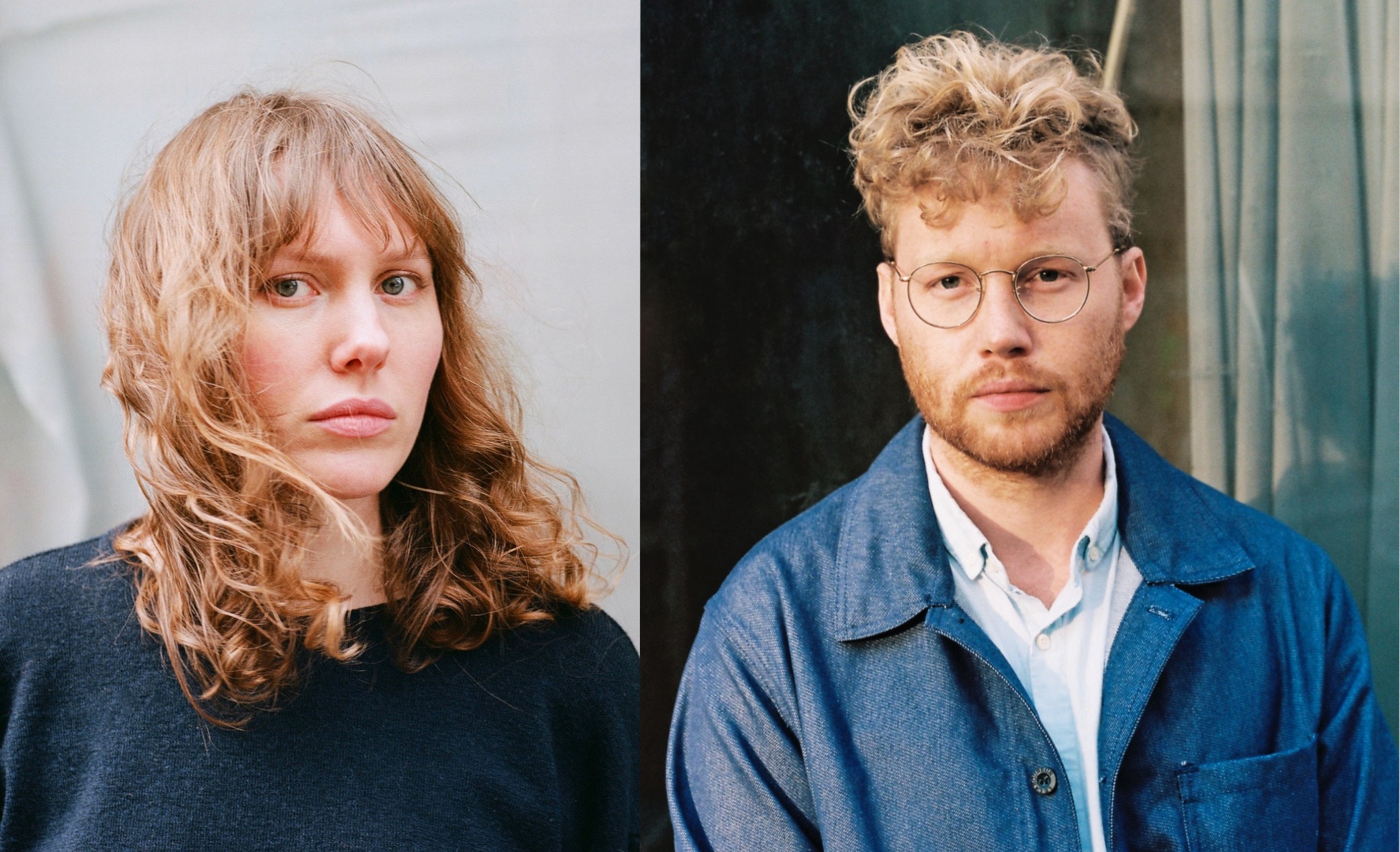
You say ‘we’… Four of you co-signed Vinocolor: who did what?
V. C. : Two teams came together quite naturally: one for the colours and the object itself, with Gala as art director and Paul Lehr as photographer; the other for the wines and the texts, with Matthieu Le Goff and myself.
G. C.: A duo more focused on wines…
There weren’t too many of you to manage the image: it must have been a real headache to create a system that could be replicated over and over again, enabling you to reproduce as faithfully as possible all the nuances of the wine’s colours?
V. C. : It was hell…
G. C. : Yes, a real obstacle course. The book took over a year and a half to produce, including several months just imagining the right device. We tried out photos with a water glass, a jar, a salad bowl… and finally settled on a fairly tall 42 cl tasting wine glass. The fact remains that, when the shots worked with the whites, they didn’t work at all with the reds. Conversely, when we thought we’d found a solution for the reds, the whites were totally overexposed. Not to mention the problems of reflections… In short, I ended up using featherboard to build a box with an opening at the bottom, the size of a business card, allowing indirect light to pass through by reflection on a white surface. A portable darkroom that we used dressed in black, under a large black sheet, in a flat with the lights off and the shutters closed, to avoid the slightest reflection…
V. C. : So that once a week, for our weekly assignment of ten photographs, there were really two moments, two moods. On the one hand, there was a very studious and diligent day of shooting. On the other, an evening of celebration, surrounded by our friends who had come to taste the open wines. We certainly did justice to the bottles sent to us free of charge by all the winemakers mentioned in the book. All in all, an extremely happy project!
Looking back, what do you remember about this book? Did it confirm the validity of an approach to wine based on its tonalities?
V. C. : Clearly, the palette of colours in wine is infinite. We can’t wait for Vinocolor to achieve some success so that tomorrow we can offer an enhanced version. Aside from our case, I still think that colour offers a very good gateway to wines. Better still, while the more I learn about them, the more I feel I don’t know much about them, their nuances, in this quest for knowledge, are asserting themselves as an indicator that is both reliable and surprising. A case in point is this report we did a while back in Germany for Regain magazine, of which I am editor-in-chief. We were visiting a winegrower on the banks of the Rhine, in a very industrial region with no charm whatsoever. Add to that the fact that the man is also an undertaker, and there was no sign of what was to come. In this case, wines of incredible luminosity. Never seen before. It was mind-boggling. Proof, among other things, that careful work, respectful of nature, as was the case here, seduces at first sight.